Fields Editor
Designing the Fields Editor tool for agricultural machine automation software
My role
Redesigned the fields editor with improved heuristics and visual language
Created new features to streamline the process of identifying and creating field data
Timeline
2024
Team
Solo designer (agency)

(Client) creates vision-based automation technology for the agricultural industry.
(Client) was my primary client during my contract with a digital agency. One of the main projects I worked on was the Field Editor for their web app software. It's a tool for growers to set instructions and geological constraints for their machines.
The Fields Editor can be broken into 4 main steps:
1. Field Details
2. Boundaries
3. Rows and Trees
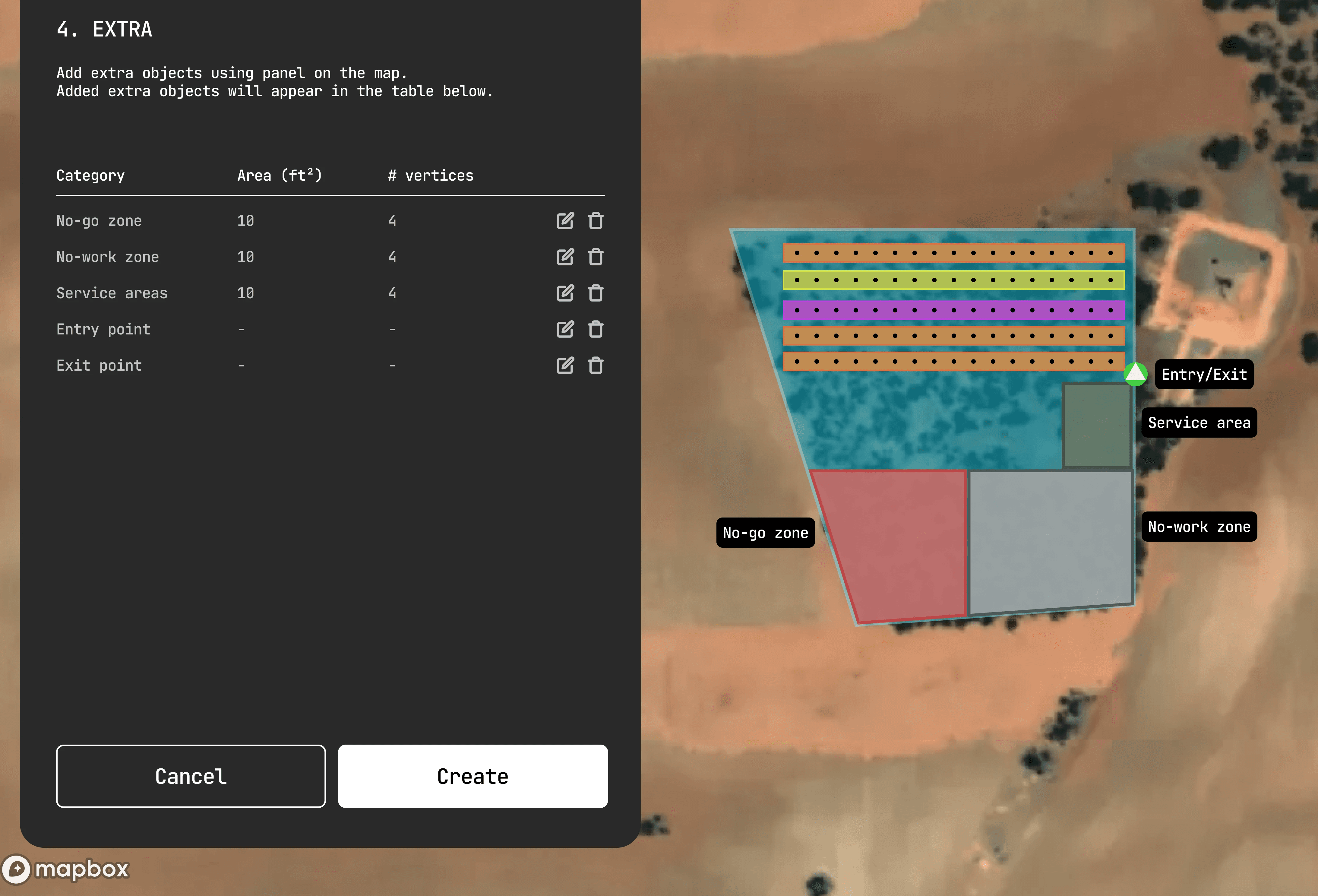
4. Extras
I identified key areas to create a more efficient tool that was also easier to use.
Field Details
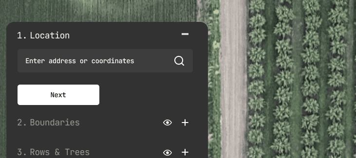
The lack of field information makes it hard for growers to navigate to fields for progress checks or issue fixes
Boundaries
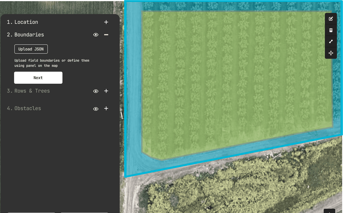
Boundaries are not editable once drawn - grower must recreate the entire boundary to make changes
Rows and Trees
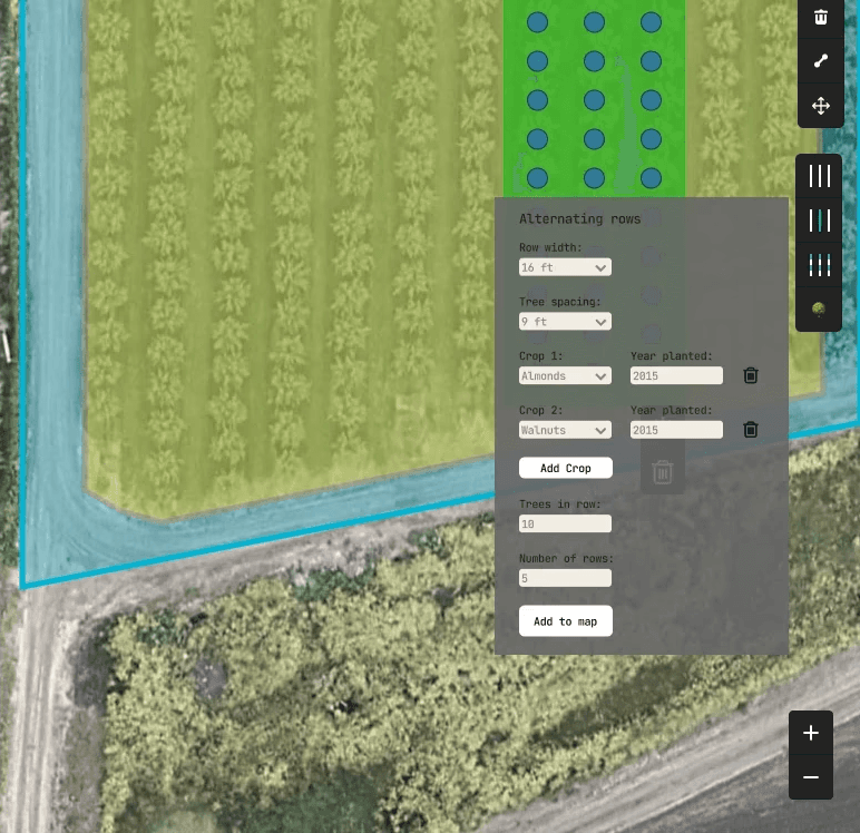
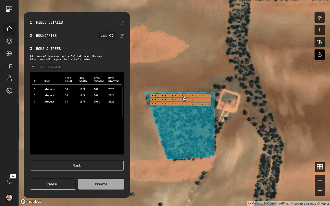
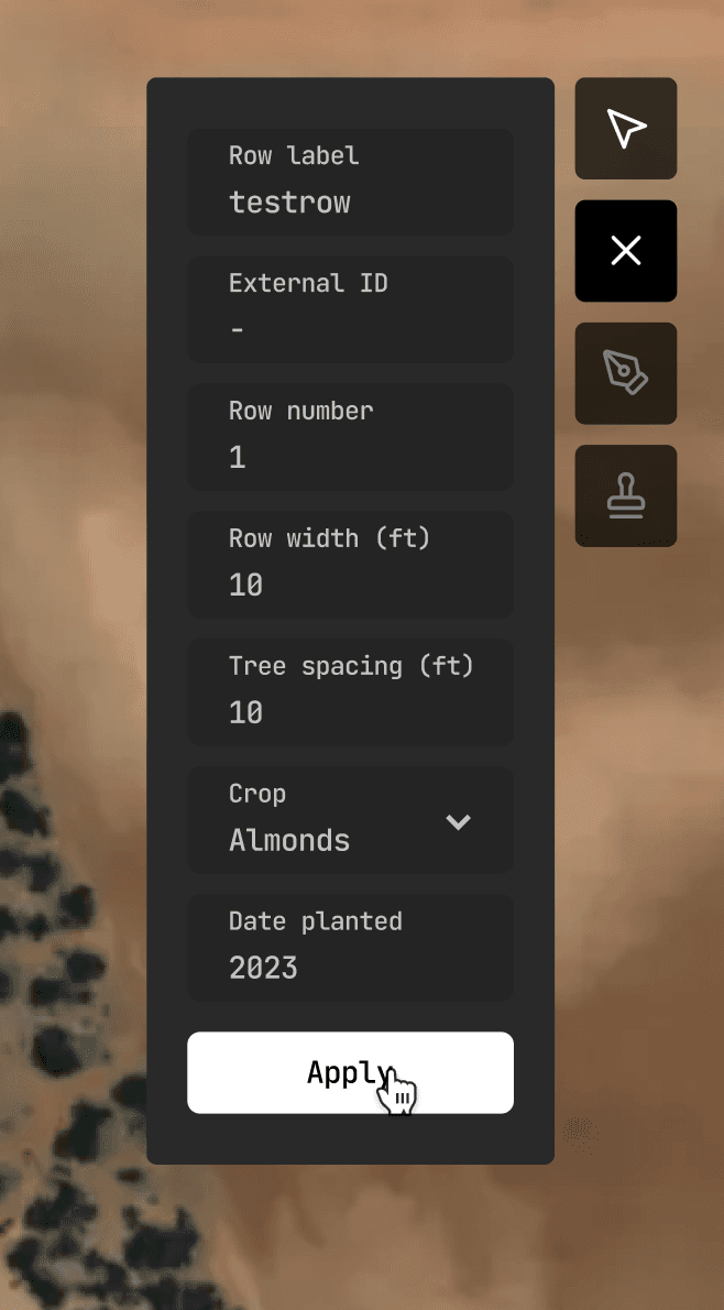
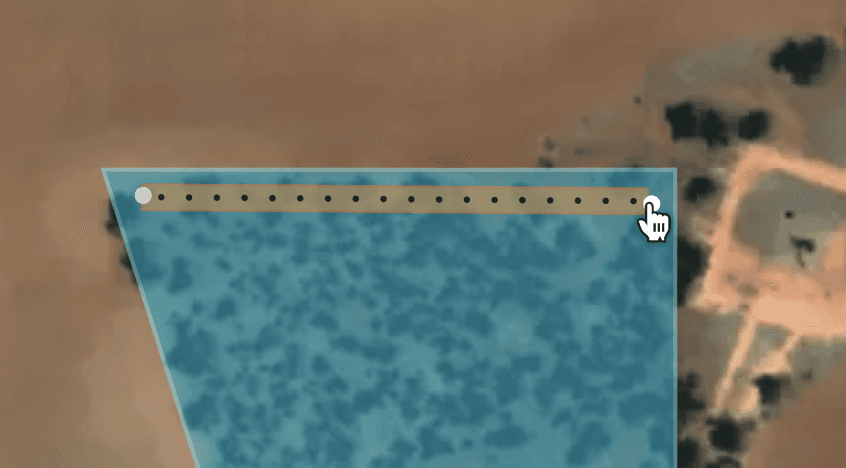
To add crop/tree rows, the grower must set all necessary information via the form to the right of the screen
Row data input fields are unclear (2 CTAs) and takes up lots of screen real estate
Extras
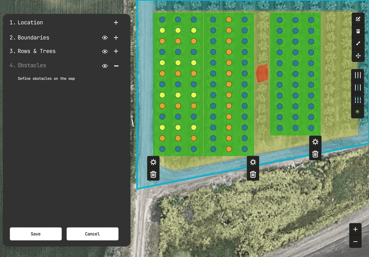
Current design uses one generic boundary and does not accommodate the various types of zones (no-work, no-go, service areas, entry/exit points)
Challenges
Not being able to directly talk to users.
This meant using other methods such as heuristic evaluation and competitive analysis to justify any design decisions.
Ambiguity in a fast paced environment.
Client communication was minimal. Lots of experimentation and self-critiquing against business objectives was key to deliver a design that would hit the mark as early as possible.
Field Details
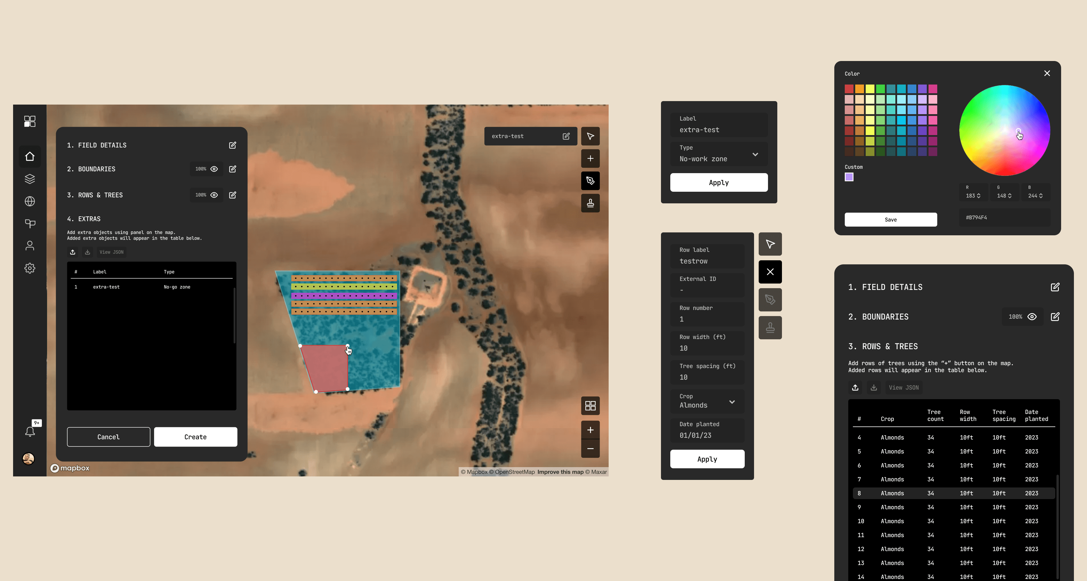
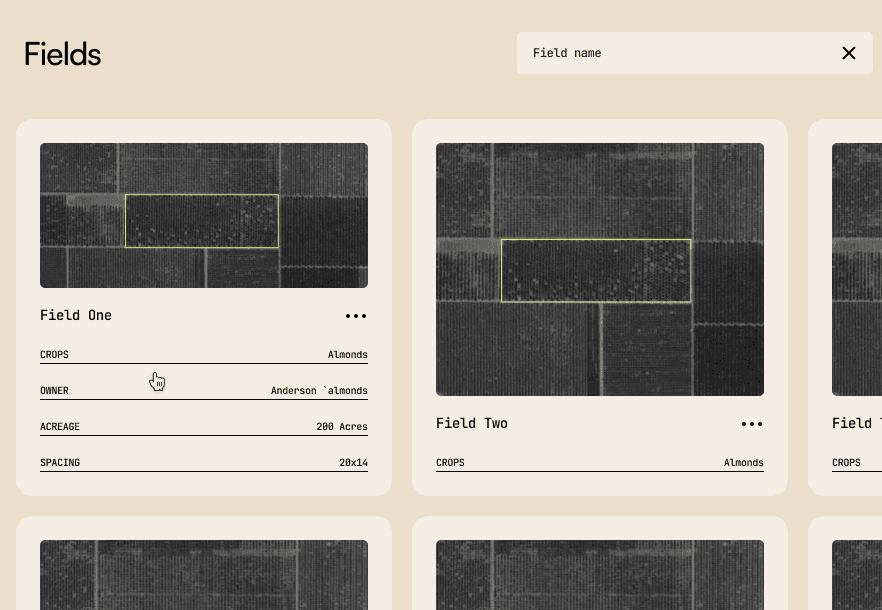
The new field details step adds information that gives each field a unique identity, allowing for improved organization and quicker navigation.
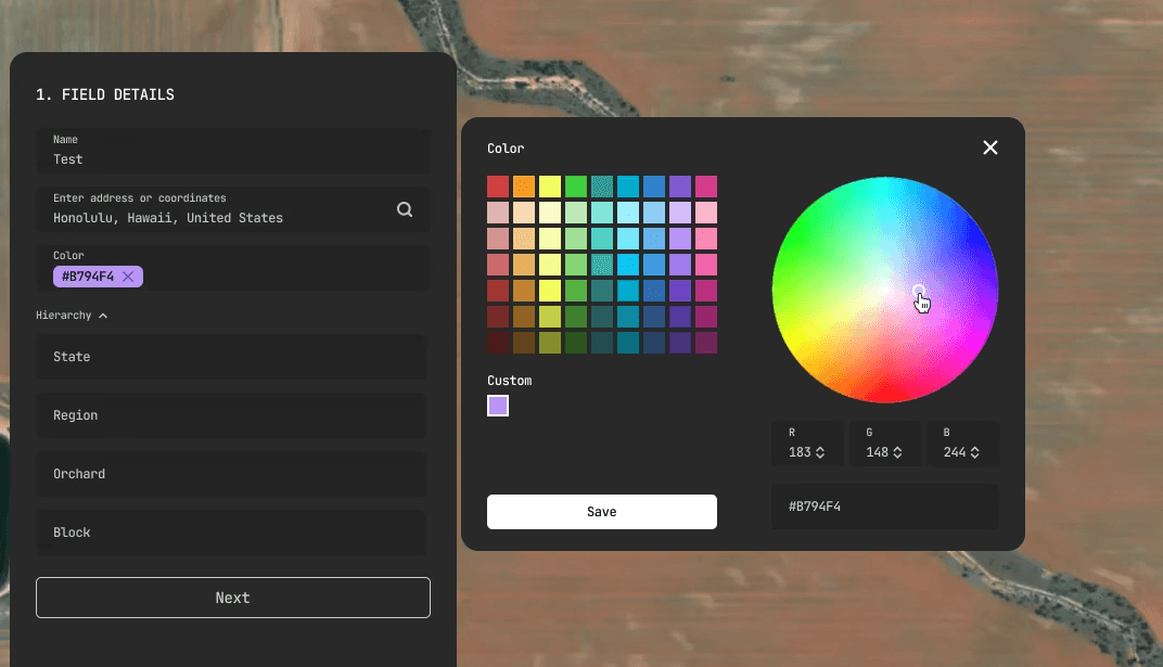
My initial assessment of the Field Details step involved the addition of basic information (field name, hierarchy for categorization). I had to take a step back to realize there was an opportunity to implicitly add value in the steps leading up to the fields editor since each field shows an image preview.
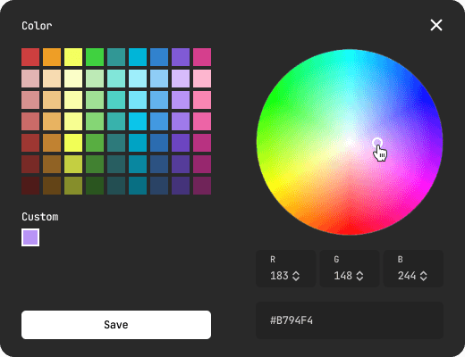
Thus, the color picker feature was born! The benefit of this feature is that it enables growers to more easily differentiate fields from each other based on the image previews when navigating through the selection of fields.
Boundaries
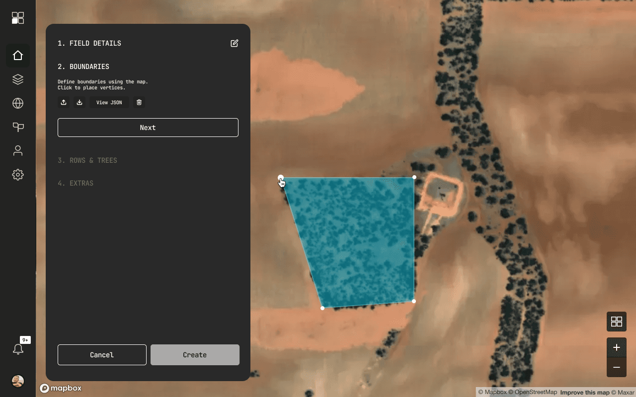
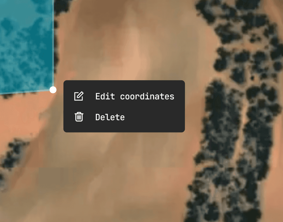
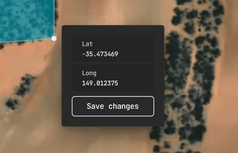
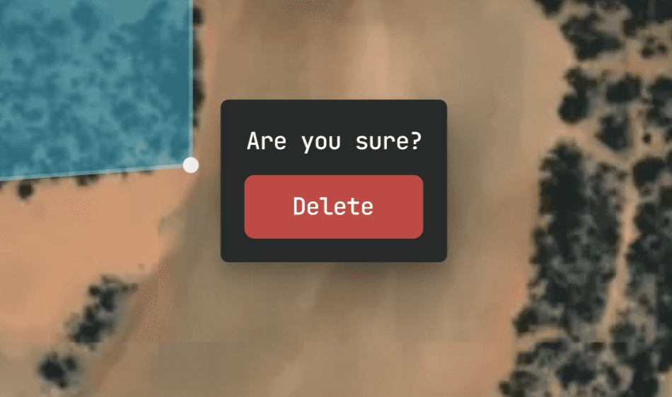
I introduced vertex based editing - a more fine tuned approach to drawing field boundaries and is more forgiving of errors.
Rows and Trees
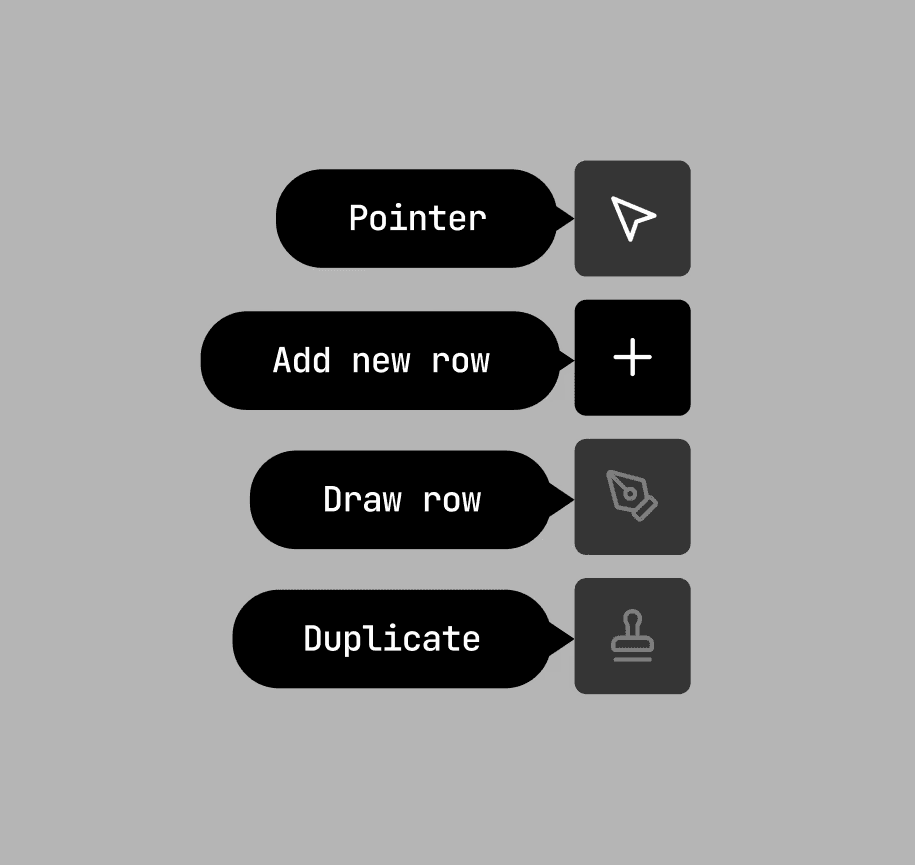
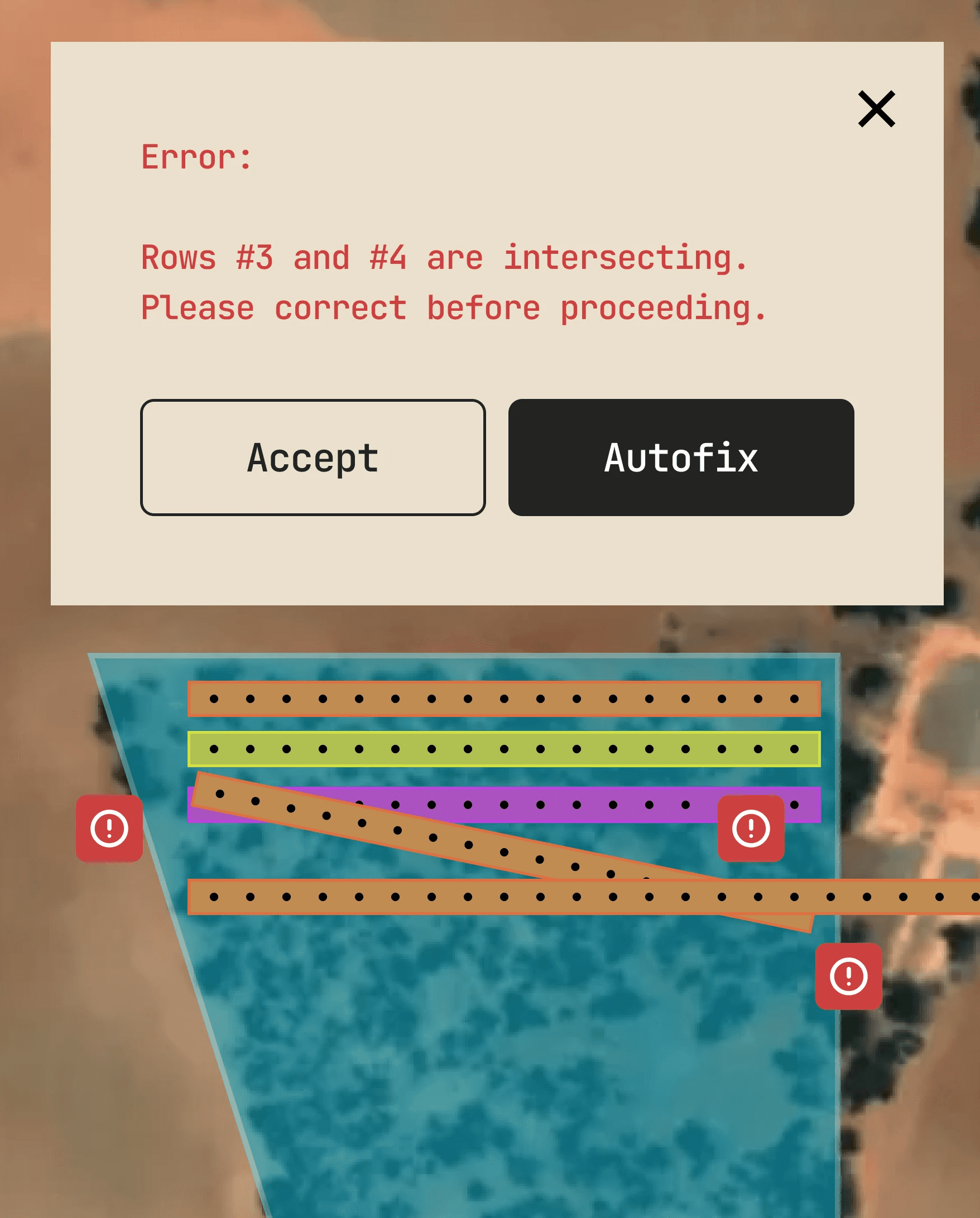
Improved heuristics (simplifying the row information form, adding tooltips, error messages) with the goal of streamlining the manual row entry process.
Extras
Addition of vertex-based boundaries that accommodate all miscellaneous zones (no-work, no-go, service areas, entry/exit points).
Reflection
My contract ended before developer handoff. On top of that, one of the main constraints of this project was the lack of user research and testing.
If I had the time, I would’ve liked to test whether or not my designs improved time efficiency, and the amount. It would’ve also been informative to receive direct qualitative feedback from the growers themselves.
Also, given that the previous designs were not part of the design system, I would’ve also liked to start standardizing components in the component library.
