Farm Link Hawaiʻi
Improving the shopping experience for SNAP-EBT customers
Timeline
Sep 2023 - Nov 2023
Team
Nicolas Kim
Product designer
Lauren H.
Product designer
R.B.
CTO
My role
Conducted surveys, interviews, competitive analysis and cognitive walkthroughs to identify the most critical features
Designed new interfaces for these features & conducted usability testing
Outcomes & Impacts
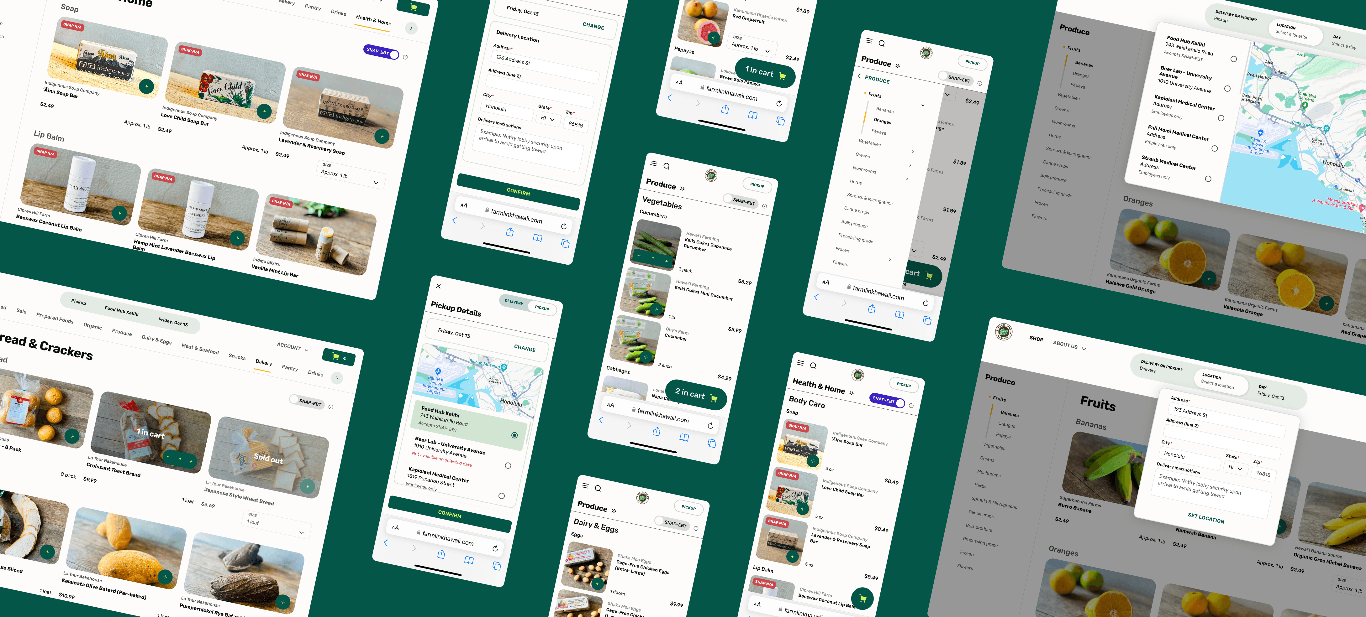
Redefined experience
I improved the shopping experience with data-driven design and stronger visual impressions
Satisfied customers
90% of customer testers agreed that the new designs were easier to use and directly addressed main concerns
Farm Link Hawaiʻi is an online marketplace that connects local customers with local suppliers.
They accept payment through the Supplemental Nutrition Assistance Program (SNAP) - a food benefits program. Local groceries, normally unaffordable to low-income households, become something for everyone to enjoy with this initiative.
1 in 10
people in Hawaiʻi were enrolled in SNAP as of August 2023 (total 157,544).
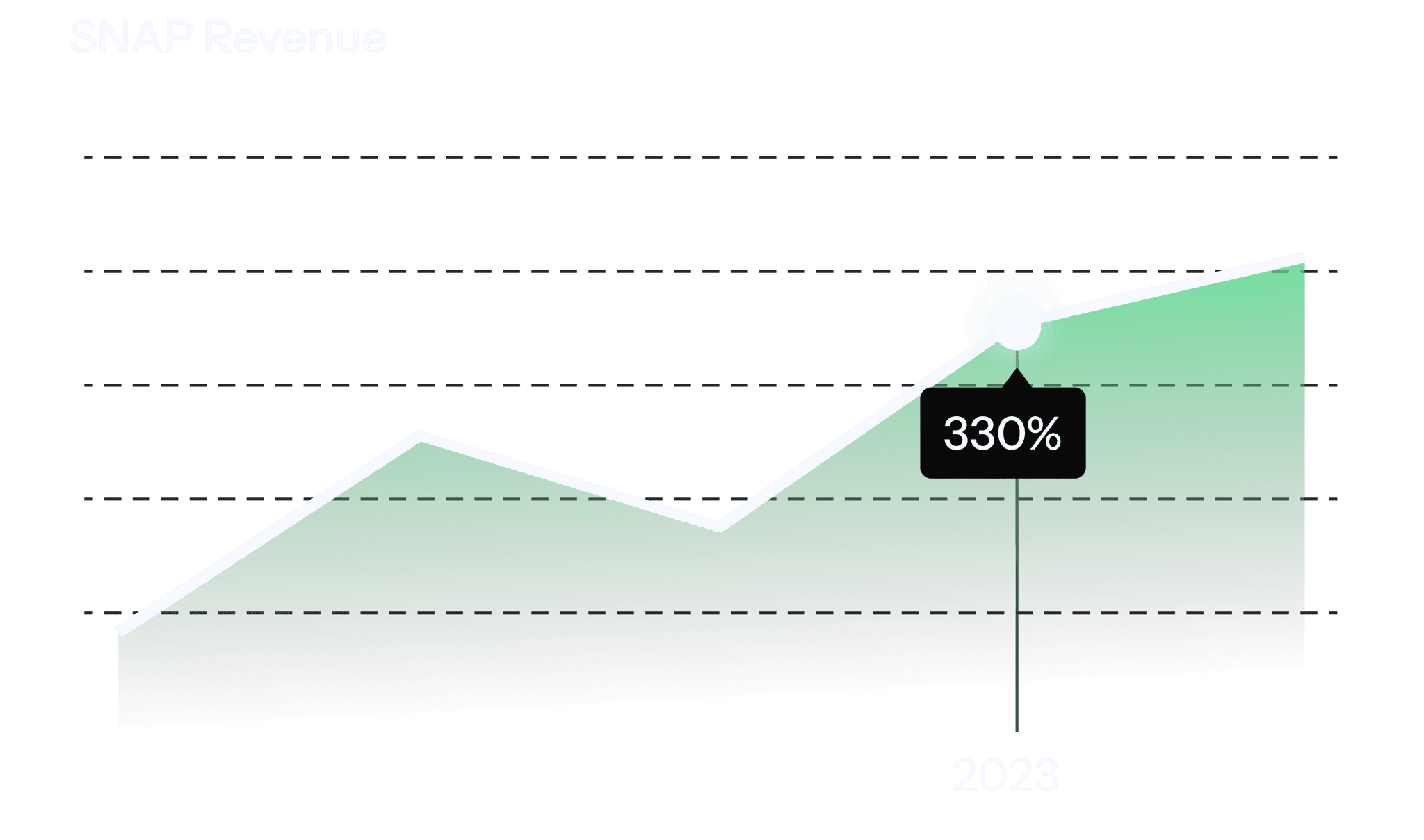
330%
Revenue increase from 2022-2023 SNAP purchases shows an increasing market size and an untapped opportunity going into 2024.
Problem Statement
Farm Link Hawaiʻi wants to improve their online shopping experience for customers on SNAP.
Main goals include increasing conversions to first order and increasing dollars spent with SNAP benefits.
Research goal
Identify and prioritize areas of the online experience that would have the highest impact on the SNAP customers
Methods
Analyzing reports & customer feedback
Surveys (43 customers)
Interviews (7 customers)
Out of 43 customers,
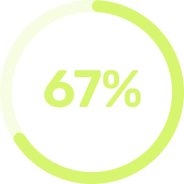
ranked ‘SNAP discount’ as a high priority area of improvement
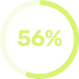
ranked ‘SNAP eligibility’ as a high priority area of improvement
Additionally, customers voiced concerns during interviews:
“Changing the pickup/delivery date is inconvenient... I need to make a new order and delete everything currently.”
L.M.
Customer
“It’s unclear whether many items are eligible or not.”
G.D.
Customer
High impact problems
Insights from research informed the decision to focus on these three highest impact areas:
Delivery/Pickup
Browsing/Item Cards
SNAP-EBT Indicators
Delivery/Pickup
Current design issues:
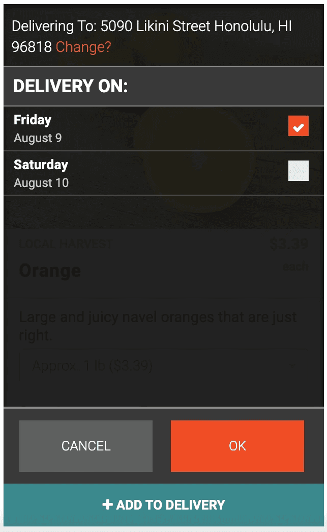
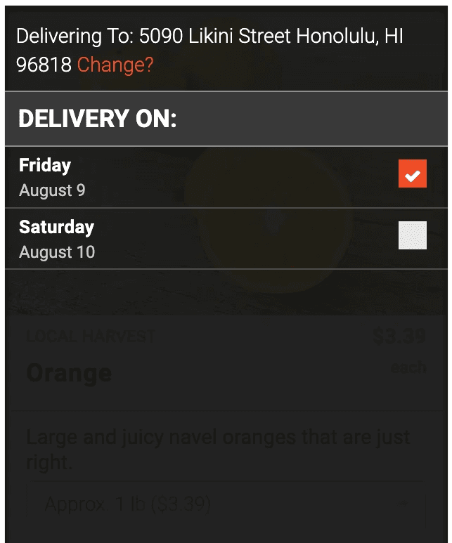
Customers need to start a new order anytime they want to change their pickup/delivery date
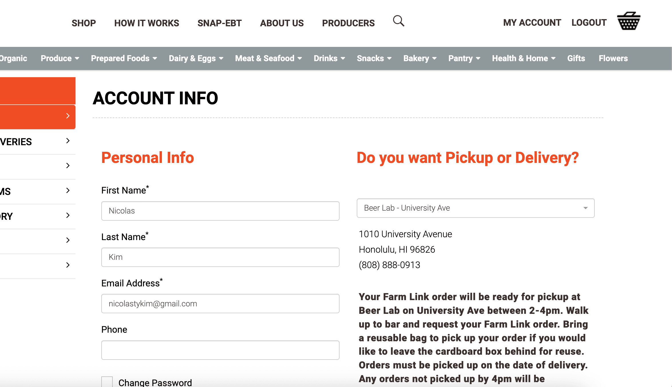
Location details can only be changed in account settings
Delivery dates are set per-item, causing customers to accidentally create multiple item carts for different days
How might we
Enable customers to change delivery/pickup options during the shopping journey and prevent issues such as order restarts and delays?
Explorations
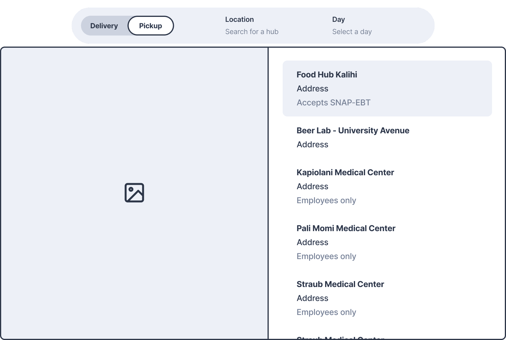
We narrowed down 8 total variations to 2 options that would consolidate date, location, and method.
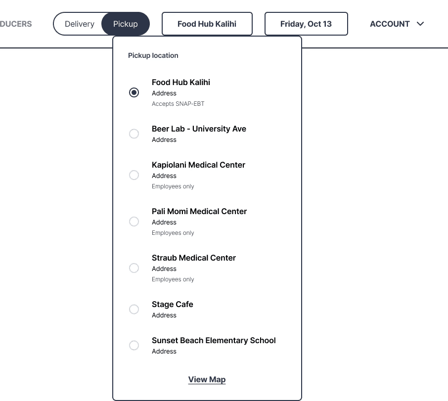
The team ended up moving forward with V2. Looking back, I think it would've been less expensive to go with V1, but V2 would be a great north star.
Iterations - Web
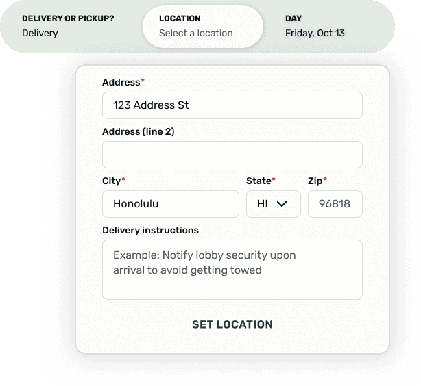
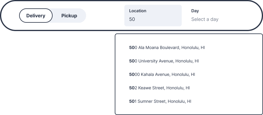
I introduced a more robust location form in later iterations for people who need special accommodations. Customers typically have their orders delivered to the same location every time - they will only need to set their location once.
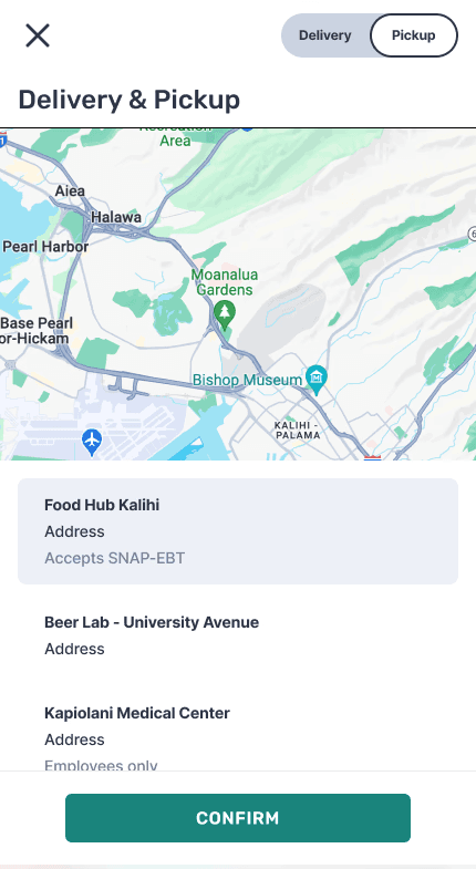
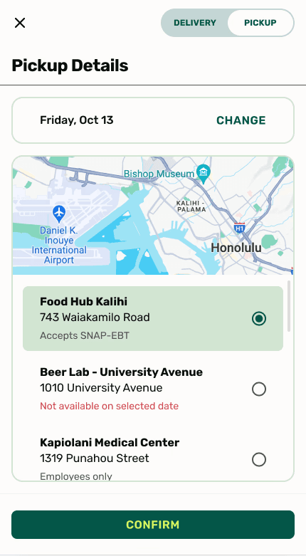
Iterations - Mobile
Pickup dates are dependent on which location was selected (and vice versa). I used progressive disclosure to allow customers to see both simultaneously on a smaller screen size.
Browsing/Item Cards
Current design issues:
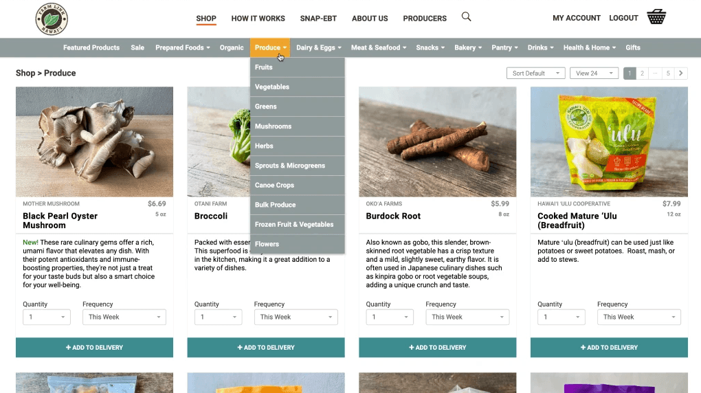
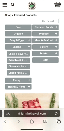
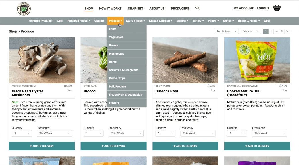
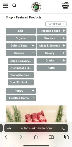
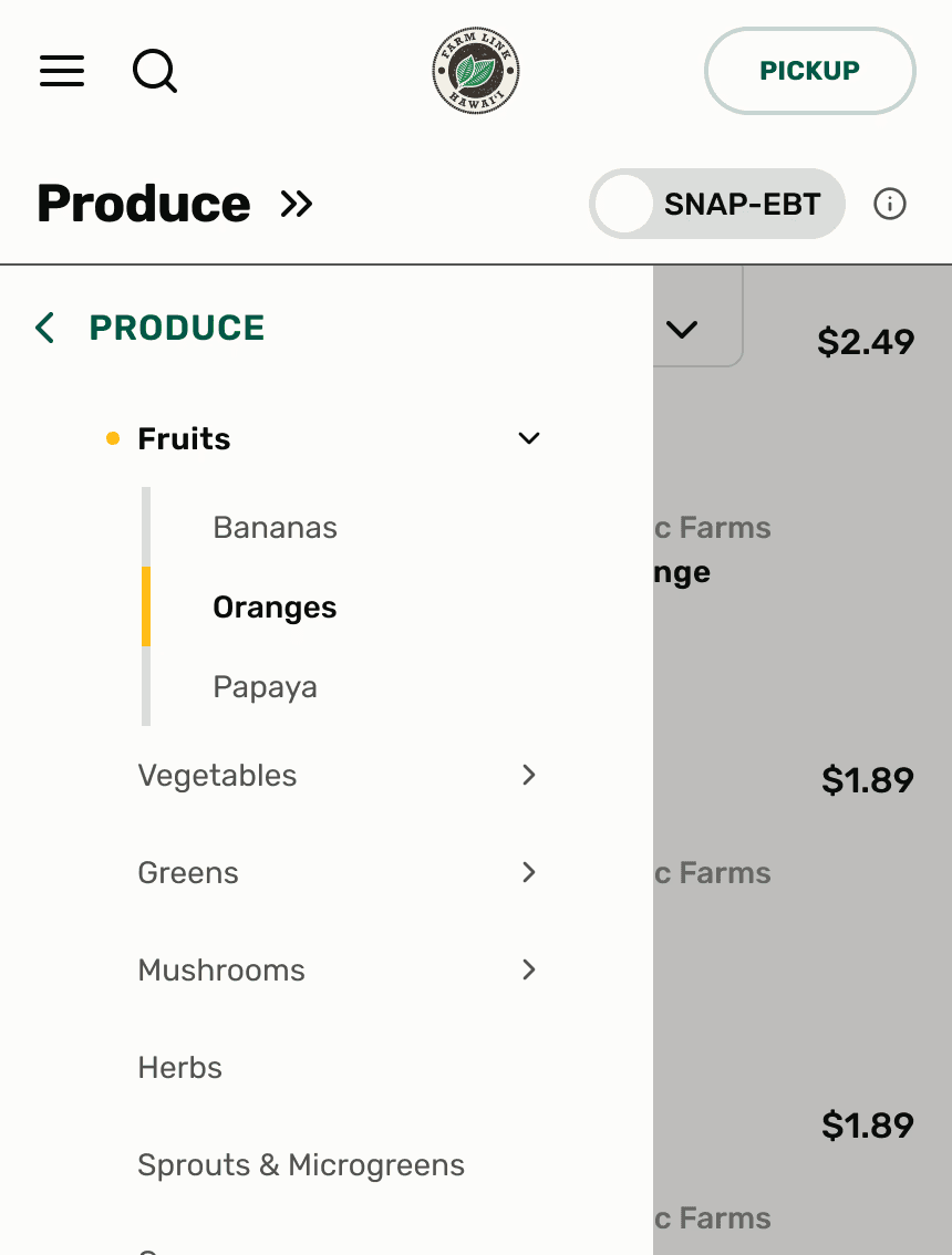
Navigation can't keep up with information architecture (too many subcategories) and mobile navigation is not optimized
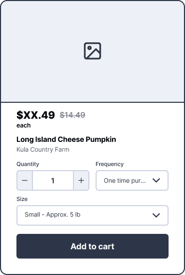
Item cards take up too much page real estate and don't fit within the vision of the new shopping experience
(These problems are not unique to SNAP customers, but were identified as a relevant part of the holistic shopping experience. The goal of improving product browsing was to encourage a continuous shopping experience, thus increase dollars spent per order.)
How might we
Provide a seamless browsing experience that makes it easy for customers to add items and increase average order value?
Explorations
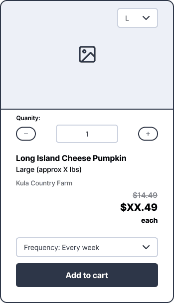
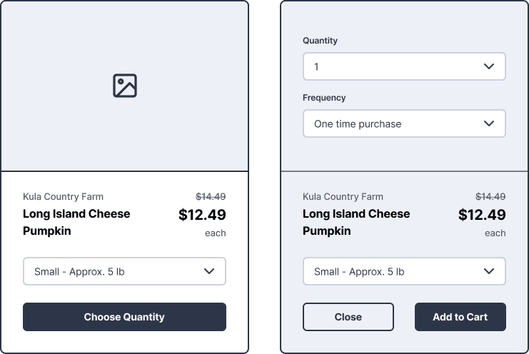
My team focused on the browsing experience as a combination of navigation + cards. Below are a select few explorations for both.
Iterations - Cards
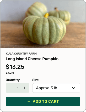
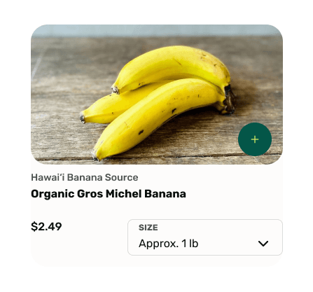
Many food items on FLH are offered in a wide range sizes so having a dropdown was most accommodating. The CTO wanted a more subtle “Add to cart” button.
Iterations - Navigation
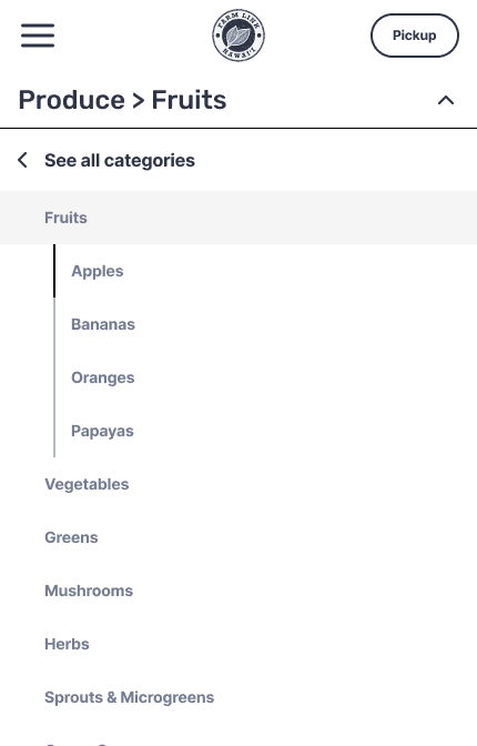
In testing, users struggled to differentiate the back button from the list of categories on the 1st iteration. Visual indicators and increased spacing improved results by 8s on average.
SNAP-EBT Indicators
Current design issues:
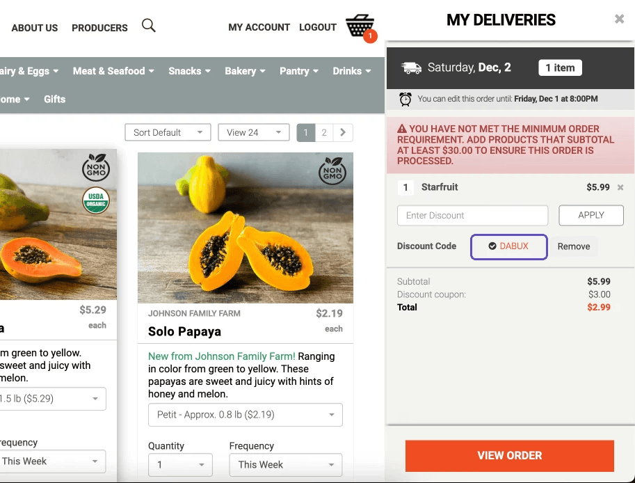
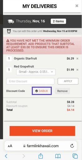
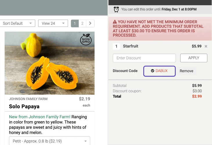
Customers can only see an item’s SNAP eligibility and the applied discount by adding the item to the cart (reflected as "DABUX" discount code)
How might we
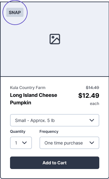
Create an easy way to identify SNAP-EBT product eligibility to promote use of benefits?
Explorations
We took various approaches to display SNAP eligibility, considering options that would require minimal budget to integrate.

Nic's thoughts
The SNAP indicator initiative was initially dumped by leadership.
However, seeing that:
Our research showed that SNAP eligibility was the highest rated concern
Data shows that on average, SNAP customers spend more dollars per order than non-SNAP customers
SNAP customers are an increasing demographic among all Farm Link customers
I gave the rebuttal to keep the feature. Not only would we be ignoring the main concern from customers, but we would also be limiting the potential of this untapped market.
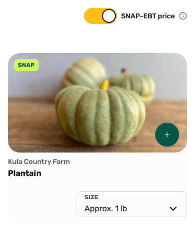
Iterations - Toggle and cards
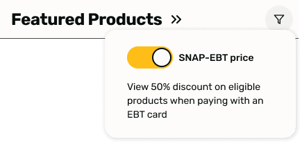
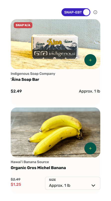
Toggle was received positively during user testing. This was my green light to make a case for keeping it in during the design proposal. Customers wanted to see which items are not eligible. Too many “SNAP” tags for eligible items felt cluttered.

Reflection
A job well done
Even though the website migration will take place after I’m gone, I can walk away feeling like this project was a success. The customers we were able to test our designs with all expressed a noticeable improvement in the intuitiveness and functionality. Stakeholders and leadership expressed similar sentiments through our design reviews and final presentation.
If I could do it again
As happy as I am with my experience, I definitely think I could’ve done a better job in two aspects: Research and early stakeholder involvement. For each round of testing, I was not able to test my designs with as many people as I had hoped. I think having more data would’ve helped me make better informed design decisions. The back and forth about the SNAP indicators cost extra time and if I had been more thorough earlier on, I might’ve had time to carry out other tasks that I wanted to accomplish.
Looking to the future
At the end of the 8 week project, the designs were shown to the company as a proposal for implementation.
As of August 2024, the company is getting ready to launch a new website design within the next few months.
