Timeline
Sep 2024 - Nov 2024
Team
Nicolas Kim
Product designer
Carlo L.
Product designer
S.M.
Product manager
A.B.
Engineer
My role
Led the redesign of the homepage/search experiences
Researched search modalities that would best support the currently available dashboard metadata
Crafted user flows and UI specs for developer hand-off
Next steps
Quality Assurance
Gathering feedback from users to prioritize future iterations
Begin "Phase 2" design work (Sharing functionality, data visualization improvements, modifying filters)
Outcomes & Impacts
Curated experience
Condensed the mobile platform into a concise search experience to minimize navigation times.
Accessibility
Crafted components and guidelines that improve the platform's accessibility in terms of typography, color, and touch targets.
Design that scales
Designed a V1 solution that can be shipped quickly, but can easily be added onto as user data and feedback comes in.
Design highlights
Click me!
Information architecture
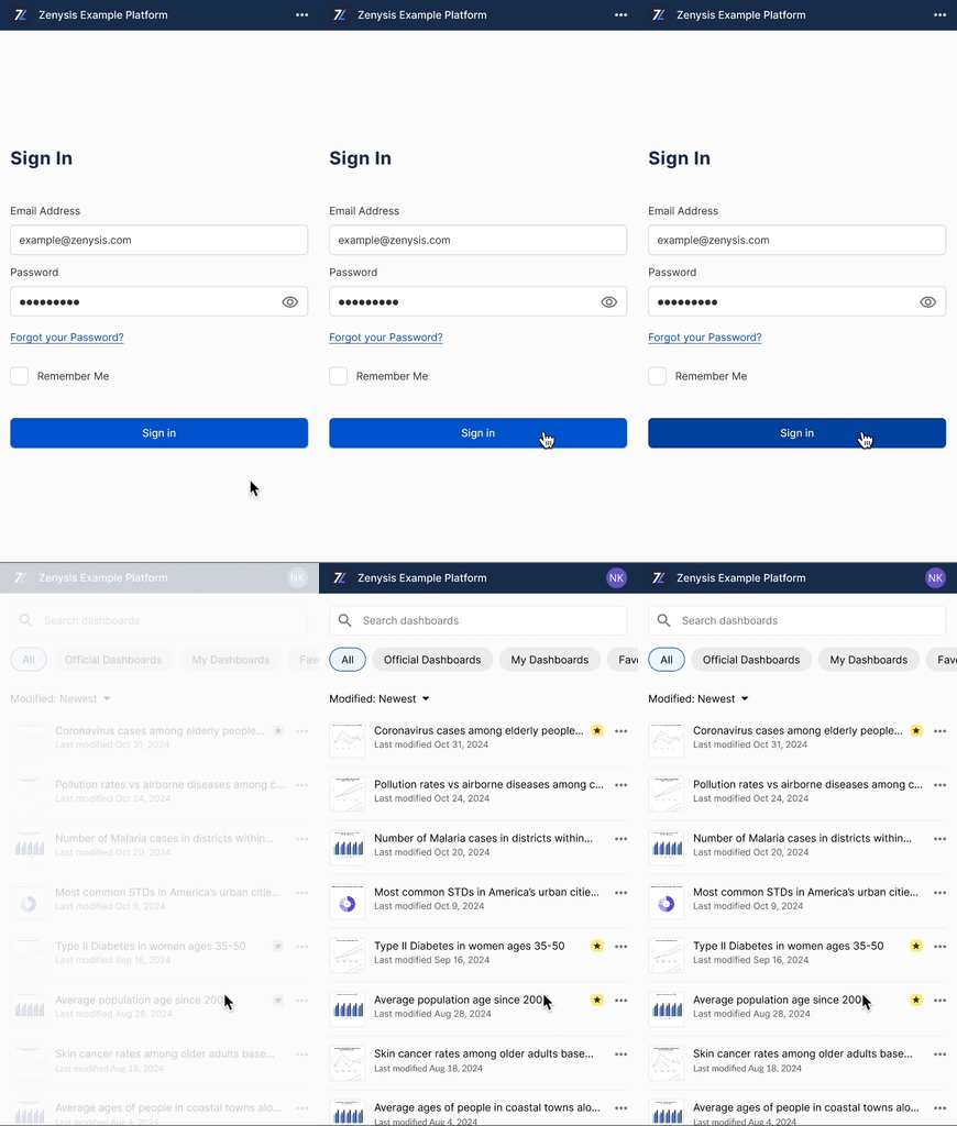
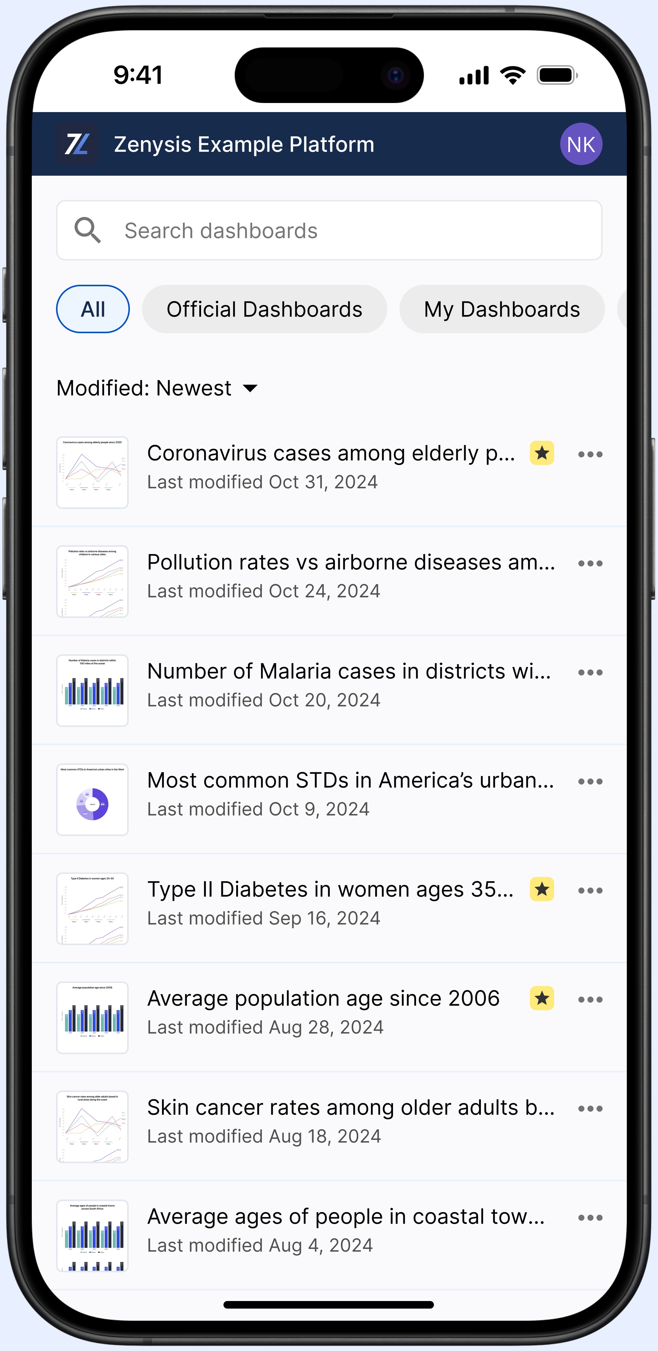
The search page has become the "Homepage" - taking users to the most relevant data, faster.
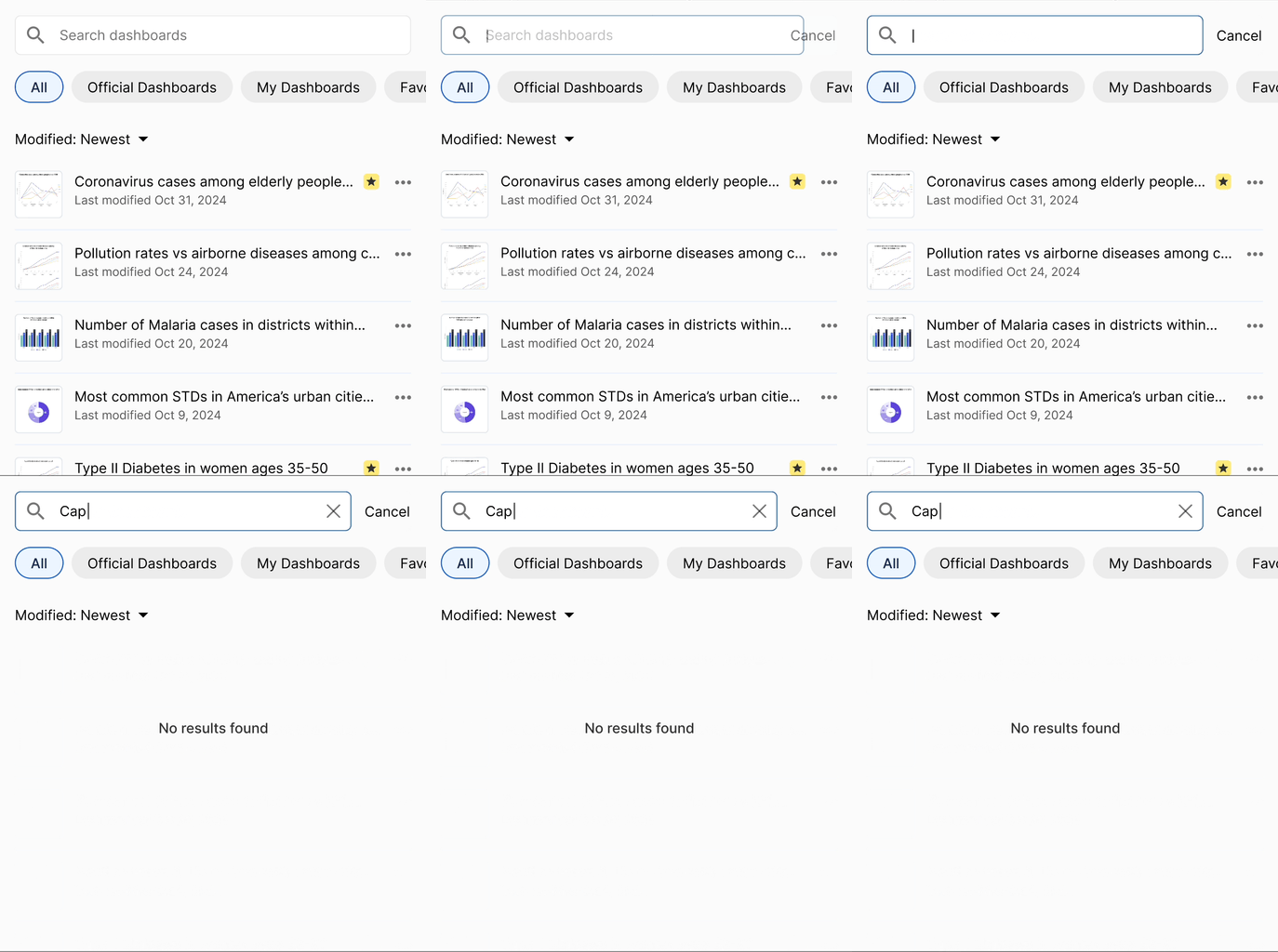
Active search
Dashboards results automatically matches user input text to dashboard titles, making it easier to sift through hundreds of dashboards.
Chip / Filter
Introduction of new chip components. The main use case allow the user to better view dashboards within the platform's existing filters.
Dashboard metadata
Dashboard cards will update to display relevant metadata based on the sort selection.
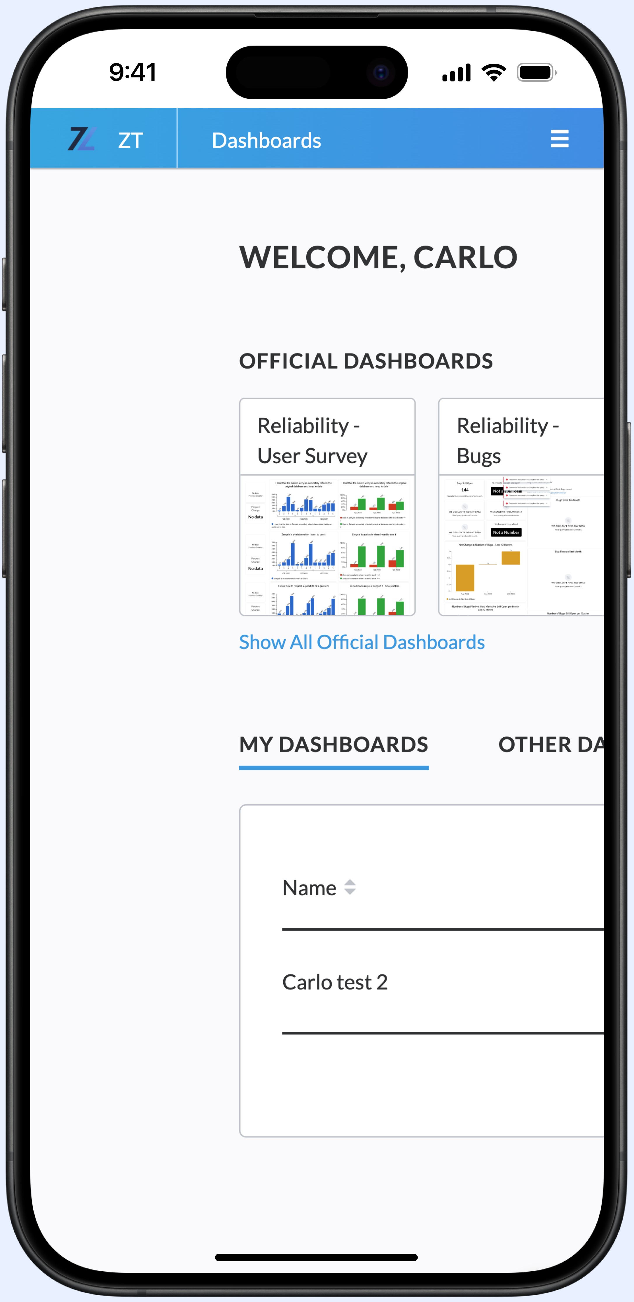
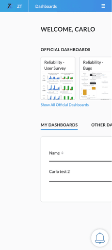
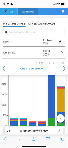
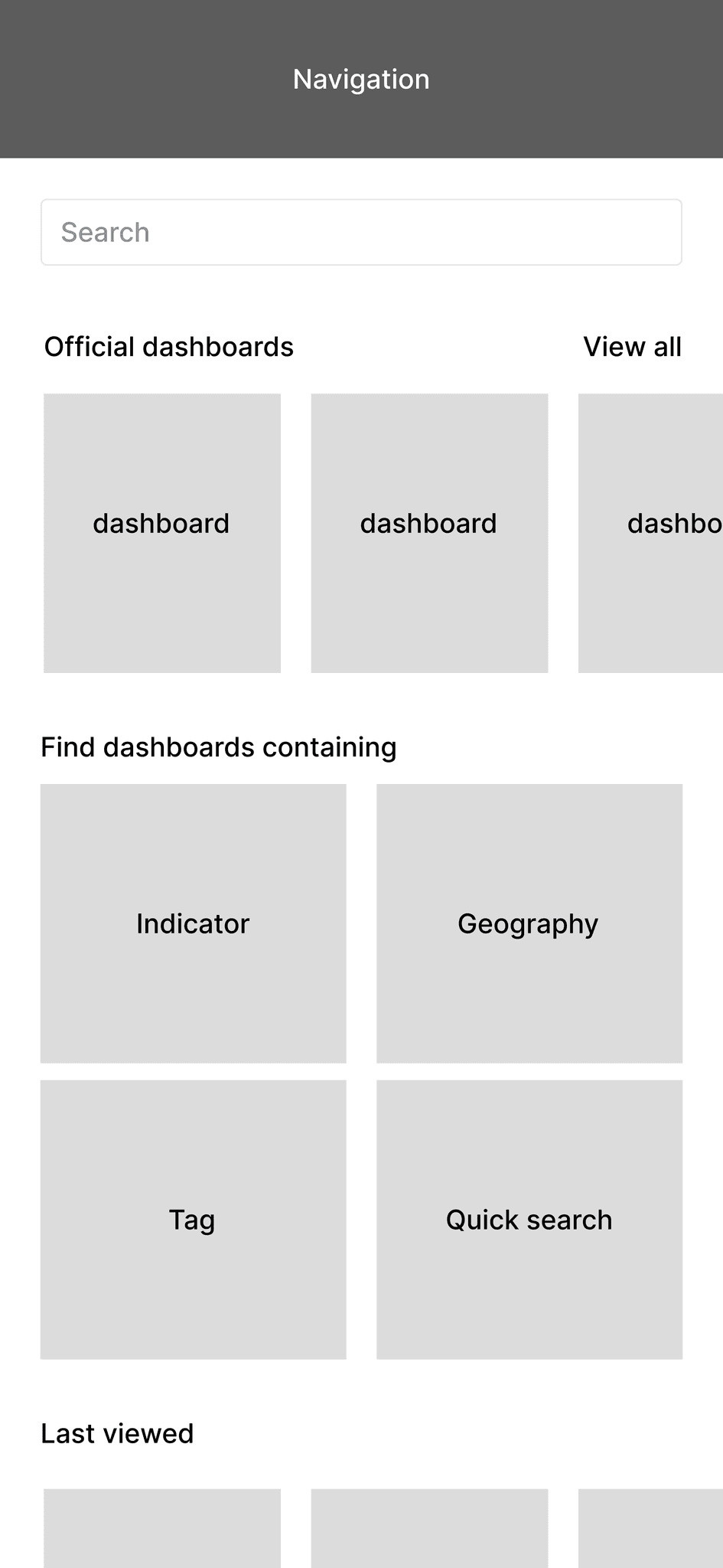
An audit highlighted sources of difficulty:
Not responsive
Currently, a majority of the content on the homepage must be scrolled to view and is not responsive at all.
Poor data organization
The homepage uses tables with large amounts of information that is hard to view on a mobile device.
Search
The search bar is not prominent and lacks guiding features that would be necessary to parse through dozens (or hundreds) of dashboards.
Problem statement
Task
Approach
Users and stakeholders expressed a desire for a new, bespoke design. I defined guiding principles that would keep my designs aligned with the user needs + business goals along every step of the process.
Homepage
The homepage should be designed to make access to relevant dashboards as efficient and frictionless as possible.
Search
The search experience is meant for targeted access to a dashboard that is not already available on the homepage.
It should have the ability to parse through a large amount of dashboards using specific search criteria (text input, filters, sort).
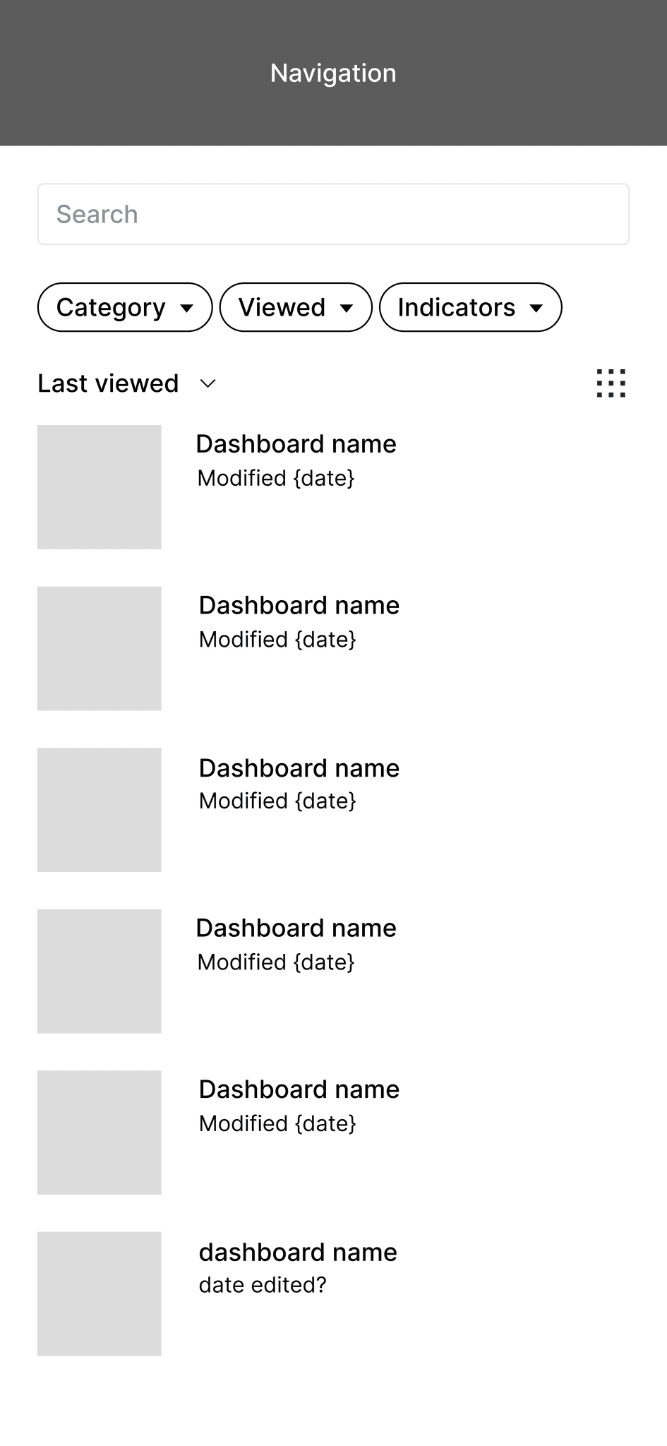
V1
List view that updates live
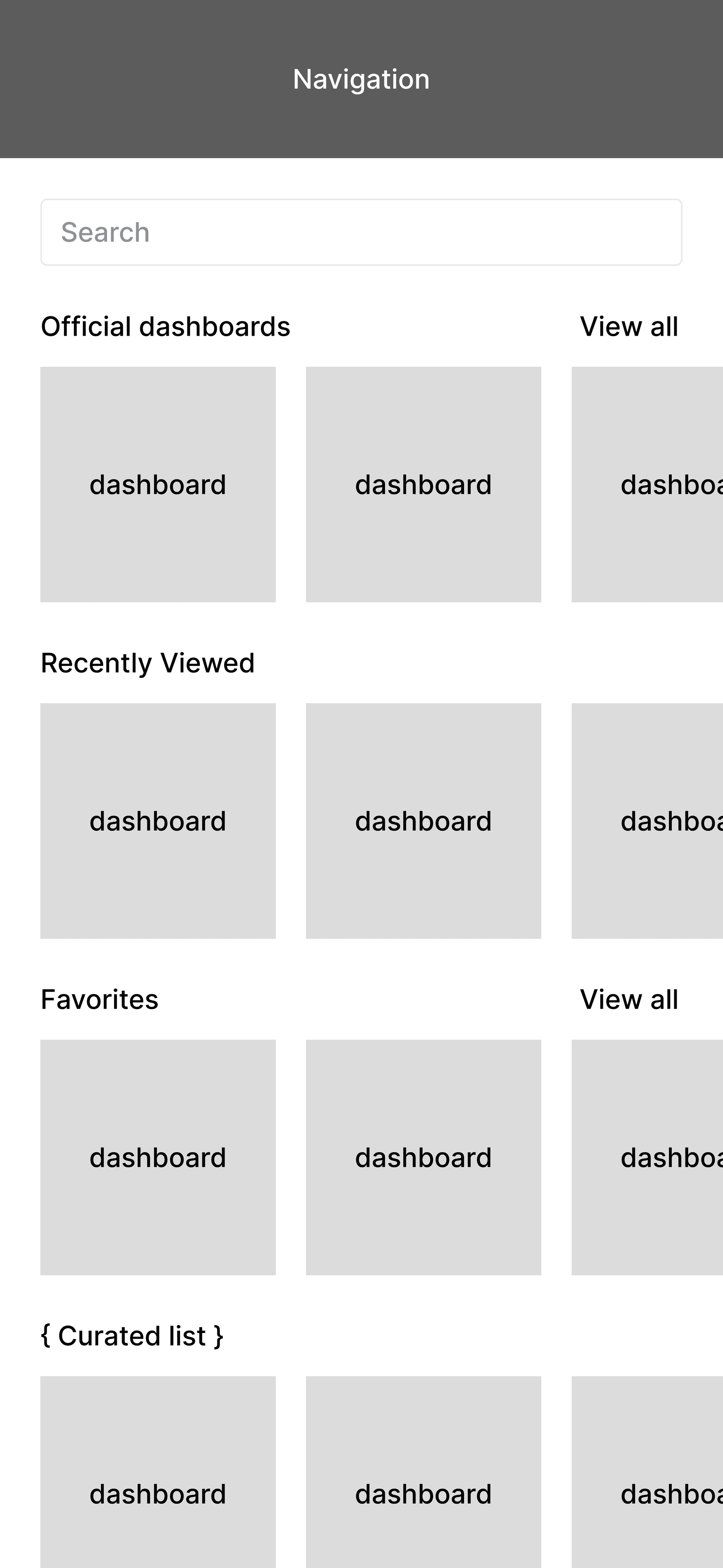
V2
Homepage w/ groups
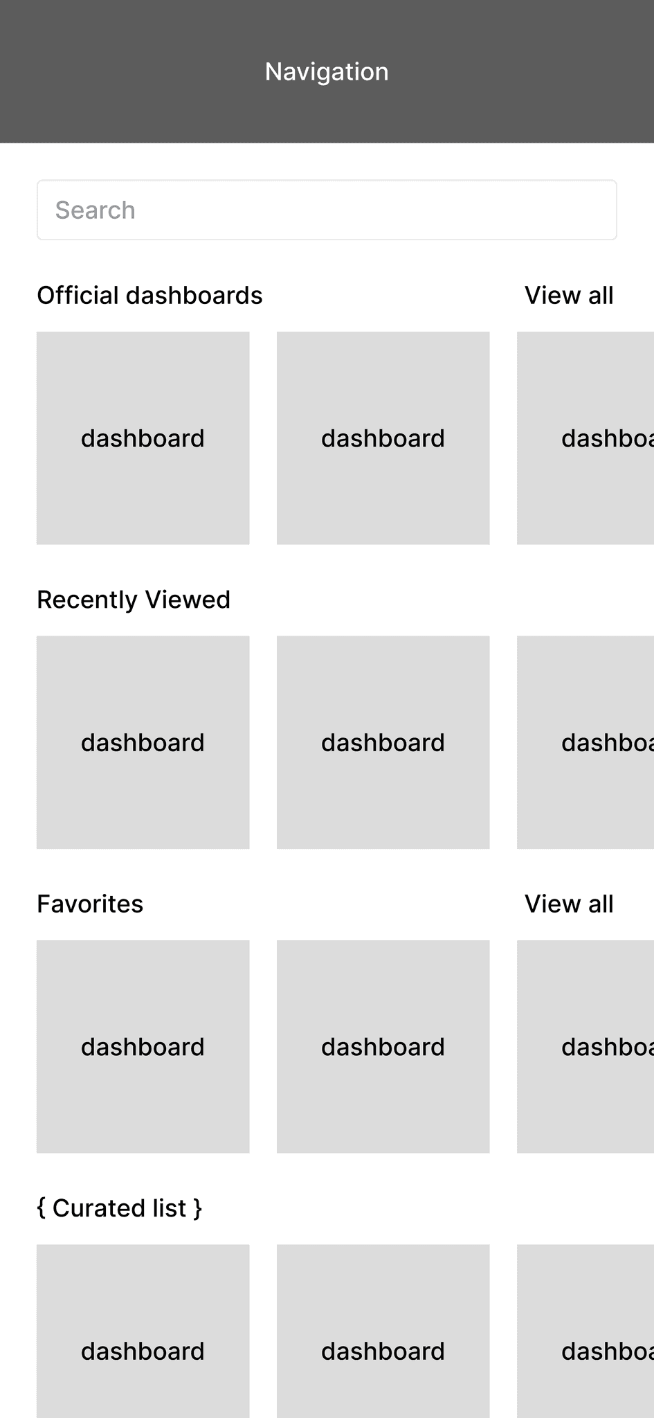
V3
Similar to V2 +
advanced filtering
Along the way, it was brought up that the platform would be a Progressive Web Application (PWA). The two main considerations with this were:
The platform will need to support offline usage
Designs will need to account for navigation without browser controls such as the "back" button
Other considerations included: prioritization of dashboard names over thumbnails, changes in sort/filter metadata, space optimization, etc.
Progressive Web Application (PWA)
An app that's built using web platform technologies, but that provides a user experience like that of a platform-specific app.
With all things taken into consideration, the Zenysis team decided that V1 was the best solution for the launch of the new mobile web app. It simplified the most important user task into a single-page experience.
Straightforward navigation? Check.
Optimized for offline use? Check.
Low development cost? Check.
Reflection
Projects aren't perfect! There were constraints and setbacks that I had to work around.
Limited access to data
As a contracted designer, I was brought on after the user interviews had been completed. This affected my process in the following ways:
My initial ideation process was heavily based in competitive analysis & best practices
I relied on feedback loops with stakeholders to verify designs
As a result, there were some instances of oversight, and having to go back to lower-fidelity work to flesh out ideas after already getting to a high-fidelity stage of design.
Gaps in the design system
The established typography system and color palette are set up in a way that made it difficult to meet accessibility guidelines. I had to break *some* rules. This required me to be very intentional about when to steer off the rails and clearly explain why I was doing so.
Budget
Classic constraint. Keeping development costs into account meant prioritizing low-lift design solutions. I also had to be selective about what new components to introduce.
The lessons I'll carry onto the next phase of this project + all of my other work moving forward.
Get people involved at the right time
In hindsight, a lot of time could've been saved if we got stakeholders involved earlier in the process. Time is precious, and with certain stakeholders I believe there is such a thing as getting people involved too early. I think I have a better grasp of knowing when to bring in people like the CTO or engineer for feedback.
Working in parallel
There were times when I had to wait for certain pieces of feedback in order to progress with design work. In addition to being better at following up, I think I could've been better at planning my weekly/daily work cadence in a way that let me work on Task A while waiting for feedback on Task B.
